Friday, January 22, 2021

Strong Your Teeth


    This ad picture shows that this toothpaste advertisement can give the consumer teeth always strong when always using it. They display the ad in the form of a billboard because it quickly sends a message to the user about the ad based on the visual depiction of people biting the billboard.

Wednesday, January 20, 2021

Mayones with Fries


To me, this picture is very creative because it depicts fries with mayonnaise. They want to advertise in this ad because they want to promote the moyones product by using fries as props. They describe the fries as a hand to take or buy the moyones product. 

Saturday, January 2, 2021

No Pills, Just Pillows


    This picture shows the medicine package, which is visual to the pillow. What is creative is this ad. They can attract the attention of people to understand these ads.

    This pillow can make memory foam topped with a gel layer that gives you a cool, soothing sleep surface. Concurrently, this picture's meaning is not harmful, no substance like medicine, and does not intoxicate. It is just a comfortable pillow to sleep. It means you sleep all night comfortably without waking up feeling hot and clammy. It's no secret that temperature affects the quality of our sleep. Feeling too hot at night is likely to disturb you and even wake you up. That maintains cooler weather and an overall snug softness to keep your head, neck, and shoulders loose and relaxed all night. Regardless of your body temperature or the temperature in your room, the pillow will retain its comfort.

Tuesday, December 29, 2020

Feel Energy


    In my opinion, this advertisment image is very creative and unique. Coco-Cola has used the form of charge to advertise the drinking water that describes feeling energy. This product can attract people to buy this brand. Coco cola makes a charge form advertisement to show that the drink can provide power.

Monday, December 28, 2020

Ice Cream Blue Bunny


    This image refers to the advertising of ice cream, especially Blue Bunny. The exciting thing about this picture is that people often put ice cream on top and ice cream cones on the bottom, but this is another result of the advertised ice cream. This ice cream resembles a mountain in a cool place near anywhere to the ice cream cone, and the yummy flavored ice cream is at the bottom.


Thursday, December 3, 2020

Lamp of Fries


    This ad shows a fast-food ad at McDonald's. This picture is very creative because it shows that the fries can be handled through a lamp's lighting, showing nine stalks of potatoes that can be seen through the lighting. It also indicates that these potatoes need light or a warm place and a switch for the user to cook. In the same, Mcdonald's is still maintaining their potato packaging when they advertise in this way.

Friday, November 20, 2020

Filet-0-Fish


    What I see in this Mcdonald's ad is the burger-shaped aquarium. But what they want to convey in this ad and make it very creative is that they advertise Filet-0-Fish McDonald burger flavored in the form of an aquarium, which describes the taste of the fish. They choose orange fish to show the core of the fish, which is golden orange when fried.

Wednesday, November 11, 2020

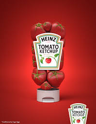
Red in Tomato Ketchup


    This ad is unique because it shows tomatoes as a bottle of sauce. They choose tomatoes as a substitute for bottles because they want to show that the sauce is tomato flavored. These advertising posters convey information clearly through the visuals they do.

Wednesday, November 4, 2020

Hot & Spicy or Burn


    This picture is creative because it means the promotion of food promotion that is a trend and demand for the target audience. Outdoor advertisements are quite common these days. They play a vital role in promoting the business. 

    Based on the picture, it has an element of art we can describe. What creatively showcases the highest quality is that they encourage KFC chickens by using such creative features using different types of lines. Continuous, broken, vertical, jagged, horizontal drastically changes the psychology of an artwork, impacting the viewer significantly. Manipulated colour in their art to provoke different feelings. Colour can be used symbolically or to create a pattern. For example, in this ad, they use dark colours such as orange and black shadow to stimulate the target audience to buy. This will keep the audience interested in the ad. The use of colour is essential to give the audience drooling and hungry to purchase the product.

    Market segments can be established using three general criteria Homogeneity, everyday needs within a component, Distinction, uniqueness from other features, Reaction, a similar response to marketing tactics. Through customer segmentation and personalized marketing campaigns, companies reduce the risk of running campaigns to disinterested users. Demographic segmentation divides the market into smaller categories based on demographic factors, such as age, gender, and income. 


Wednesday, October 28, 2020

Cup of Art Coffee


    Based on the picture, I the art of coffee is very creative. Creative thinking is the ability to stretch beyond the ordinary they need to be original, innovative, and flexible. Based on the picture, I think the art of coffee is very creative. However, I prefer art coffee that has a creative design because it is tranquil, what I saw in the picture, a cup of coffee with beautiful arts. I choose a very calming cup of coffee with a touch of fine art on the coffee. No doubt everyone has the expertise to make such coffee art. It requires high creativity and imagination as well as their skills.

    What is creative about this image is also the arrangement in taking a cup of coffee that shows the photographic artwork about the image. They use dark brown and some dark colors to give a more focus effect on the coffee. In combination with the coffee color, and it further highlights the creativity of the image, by the way, this Rosetta Art Design coffee.


Strong Your Teeth

       This ad picture shows that this toothpaste advertisement can give the consumer teeth always strong when always using it. They display...